Tag Archives: Georgia

Update 2: Predicting regional competitors from single Open results

Here’s another contribution to my analyses of the CrossFit Open competition, and is continued from here, where I looked broadly at maximum and minimum placings among Open competitors,  and here, where I examined the frequency that athletes finished within the top 60 of a given Open workout and how that related to qualification for Regionals.

A couple of notes

I want to be a little more explicit about the importance of (1) the frequency of placing within the Top 50 (yes, I’ve switch to top 50 from top 60… no real reason, but my first post discusses it a bit) during a given Open, and (2) your chances of qualifying for Regionals with a particularly high Open placing. This post will address (1), and the next post will address point (2).

I’m going to go back to “maximum placing”, which seemed to cause some confusion in my past posts. Maximum here is highest absolute value. For instance, 398th is a higher place than 2nd place. So, “maximum” is “bad” if you’re interested in competing.

I’ve got plots to present, and I will summarize them in the last paragraph of this post.

Past probabilities of qualifying based on frequencies of placing within the Top 50

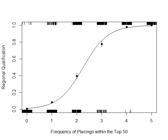
Fig. 1: Regional qualification (1 = Yes, 0 = No) of athletes who placed within the top 50 on 0 to 5 workouts in a given open. The line represents a generalized linear model fitted to binomial qualification data, and predicted with top 50 placings frequency. Closed points are empirical probabilities with standard error.

Figure 1 is another way of exploring how placing in the top 50 during a Open competition can affect an athletes probability of qualifying for Regionals.

There is a lot going on in the plot, so let’s build an explanation. Because of how math and statistics work, I have to code Regional Qualification as 0’s and 1’s. In a given Open competition, if an athlete qualified (i.e., her overall place was < 50), I assigned her a 1 for “Yes, qualified.” Conversely, athletes placing > 50, received a 0 for “No, didn’t qualify.” These 0’s and 1’s are plotted along the top and bottom of the graph – each tiny, vertical, line is one, individual athlete during one of the two Open competitions I had in my data set. There are so many, very tightly packed lines together that some times it looks like a big, solid line. For example, the little lines are distributed along the x-axis according to how many times that athlete placed in the top 50 during the Open (from 0 to 5 times). There are a lot of athletes who never placed within the top 50, so there appears to be a solid line above the ‘0’ on the x-axis.

The curved line is the cool thing. It’s a model fitted to the regional qualification data that lets one estimate the probability an athlete will qualify for Regionals as she accumulates top 50 placings in an Open. So, as I’m writing this, a number of athletes have placed within the top 50 in the 2014 Open for both released workouts, including Emily Bridgers. Assuming she drops out of the top 50 for the other 3 workouts, she’s still got a 40% of making it.

And that’s what the closed points are – empirical probabilities, which I can use to assess how well the line fits the data (the points should be, and are, pretty close to the line). Starting from the point on the left, the points fall at 0.6%, 8.2%, 40.0%, 77.6%, 98.0%, and 100%. These values are with respect to the number of times an athlete finished top 50 in an Open.

So, you finish 5 times within the top 50 – you’re obviously golden; you will qualify for Regionals. You never qualify in the top 50… wait, you still have a 0.6% chance! (beware, this is only taken from women who finished top 180… and no other variables are accounted for… like maximum placing).

Summary

Here’s the interesting part: rapid change. The line in Figure 1 rapidly curves up, illustrating that as one accumulates top 50 placings during an Open, chances of making it to Regional rapidly increases.  In fact, finish top 50 once, and my subset of data suggest you have an 8% chance of making it.  Finish twice, on the other hand, and your chances jump up 32% (totaling 40%). With three top 50 finishes, another 37% jump (totaling 77%)!

Update 1: Predicting regional competitors from single Open results

UPDATE – 5 March 2014 – Continued from previous post.

Here are a couple of historgrams illustrating the frequency of top 60 placings for competitors in a given year and region. So, an athelete, say, Emily Bridgers, completes 5 workouts during an Open. How often does she place in the top 60 during that Open event? 5 of 5 times. I wanted to consider this for 1800 athletes, 600 of which  finished in the top 60 over two years and five regions.

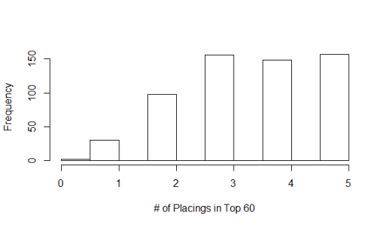
So, how many athletes did the same as Emily, finishing 5 of 5 workouts in the top 60? 150 (Fig. 3). Yes, there are duplicates – Emily did this (5 for 5) both years, and it’s counted as two ‘separate’ athletes in the estimate. There are other criticisms one can provide, and maybe I’ll consider them… but here’s a summary of the data I’m talking about:

Fig. 3: Frequency of placings in the top 60 for the top 60 Open finishers.
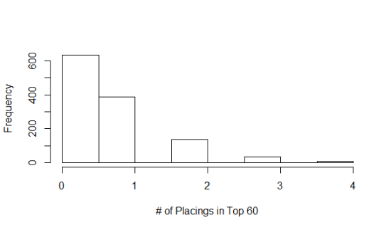
Fig. 4: Frequency of placings in the top 60 for athletes finishing from 60 to 180 during the Open.

I split the rankings into two groups: the Top 60 finishers (Fig. 3) and athletes that finished between 61st and 180th (Fig. 4). Within the top 60, the  majority of athletes placed within the top 60 during five open workouts at least 3 times – about 450 of 600 did this. About 100 athletes finishing in the top 60 placed within the top 60 twice during a given Open, and a handful (~45) even did this once. In fact, there were two athletes that never finished within the top 60, and finished with an overall placing of 56th and 58th… Why? Because their placings were consistently between 62 and 140. They never had a bad workout.

That said, look at Fig. 4. There were nearly 400 athletes that placed in the top 60 during an Open, but placed overall between 61st and 180th. 400 of 1200 athletes. So the Open works both ways, and this is supported by Fig. 2 (look at the right side of the graph… see how many points there are really close to the x-axis) and Fig 4., one good work out will not guarantee you a spot at Regionals, and one bad one won’t guarantee you’re knocked out of the running.

These results suggest that Regional qualification is weighted heavily in performance consistency during an Open. I would like to point out the sliver on Fig. 4, representing the number of athletes (six of them) finishing FOUR of five workouts within the top 60… and still being booted from the top 60 overall. This says, don’t screw up too badly on a single work out. And by too badly, the highest place for these six athletes: 304, 279, 395, 394, 511, and 449.

Maybe more to come… I started an R script…

Predicting regional competitors from single Open results

Let’s get this straight. The CrossFit Open is five workouts for a reason: a single result does not accurately predict whether you’ll be headed to the Regional competition, and Open results have even less predictive power for Games competitors. There is more to being the “Fittest on Earth” than performing well on a single, 10 minute, AMRAP.

Sure, these statements seem obvious. But I’m a scientist, and I like numbers. And, frankly, sometimes my wife is hysterical about her performance, to the point where she throws out words like ‘impossible’ after completing a single Open workout and not performing to her liking. So, I set out to look at some data, and challenge myself to calculate some probabilities (’cause this is how I show my affection…). I’m writing as I work (or waste time…), and I’m not confident that I can attain my goal, that is, to provide a probability distribution of qualifying for Regional competitions (~ top 50 Open competitors from each region), given a result from a single Open workout. I may just provide some graphs and a few numbers that suggest the first paragraph in this post is true, without actually getting to this distribution thing. After all, I’m an ecologist, am more or less self taught in statistics and probability, and I have a job. Plus, I like playing fetch with my dogs.

I’ve taken results from the 2012 and 2013 Open competitions from the top 180 finishing women in five US regions: South East, Central East, South West, Southern California, and Norther California. There’s much more data to be copied than what I’m working with, but I think these data are representative of the whole, and I couldn’t figure out how to access raw data without copy-paste.

From memory: In 2012, the top 60 went to Regionals, while in 2013 the top 48 were selected. Similarly, the top 48 will be selected in 2014. I’m rounding the selection to 50, given that there are probably a few qualifiers that will compete in a team or decline all together. This is likely a conservative selection cut-off.

A few plots

(I’m not proud of these – they are quick and dirty Excel ‘charts’… don’t tell my students).

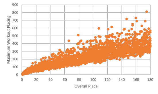
Fig. 1: Maximum workout placing across all five workouts for two years and five regions (women only).

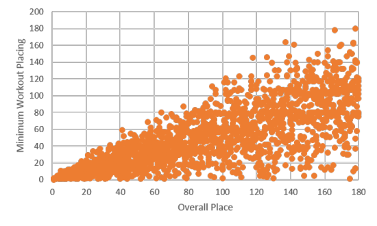
Fig. 2: Minimum workout placing across all five workouts for two years and five regions (women only).

The first couple of plots are simple: of the top 180 women in five regions and across two years of the Open, what were their maximum and minimum placings? There is a lot of variation in both plots, and I was tempted to conclude that the scoring method of the Open, which is used to calculated the overall placing (x-axis), was weighted heavier for the maximum placing. I think I’d have to calculate a coefficient of variation to be sure though, given that the scales on the y-axis are pretty different for the two plots.

Bigger picture

There were no qualifying athletes (top 50) who placed higher than 268 in any one workout, and the average maximum placing was 90. Further, all qualifying athletes scored at least one workout below 60th place, with an average minimum placing of about 15th. What this means to me is that if you want to qualify, don’t have any placings above 300, and place within the top 50 at least once (probably more… maybe that’ll be the next calculation: number of workouts placed in top 50 or 60). I round these numbers a bit for a couple reasons: (1) there are more competitors this year, and (2) the I suspect consistency (below top 60) is more important here.

Eastern Glass Lizard

On my way into Armstrong Atlantic this morning, I found this legless, Eastern Glass Lizard: Ophisaurus ventralis.  It was positioned in the posture in the photographs when I encountered in on the side of the road, so, when I dismounted my bike and approached it, I hesitated to grab it to avoid being bitten… Then, when I did grab it, I realized it was stiff and dead.

Glass lizards resemble snakes, in that they don’t have legs, but have external ear openings (the hole on the head, behind the eye) and movable eyelids.  Relative to snakes, they’ve evolved from a distinct lineage of lizards and belong to the family Anguidae. Anguids look a bit like skinks, especially those  Anguids with legs, and I’ve encountered one in Costa Rica – a beast of a lizard called a galliwasp.  Glass lizards are reportedly pretty common around here, and I’ve seen one other on Skidaway Island, but it was too fast to catch.  A friend also captured some on video mating… (edit: before seeing the video, I thought the subjects were anguids – looks more like broad-headed skink though)

The dermestid mystery: solved

About a year ago, I noticed Amos frequently and obsessively scratching himself, and, after some searching, I discovered a single flea.  I promptly treated him, but often felt something crawling on my legs and arms in my bed when I went to sleep.  I would usually panic a bit – oh no! fleas in my bed! –  but invariably, I would find that the insect responsible for disturbing a few leg hairs were Dermestid beetles.  Beetles in this family are frequently used to strip flesh from carcasses and clean bone and are not known to be harmful or even bite.

I couldn’t figure out where they came from, but I was glad they weren’t fleas.  The problem disappeared shortly after I started noticing them, but recently returned.  I was still without an answer to the beetles’ origins, until yesterday.  I moved an ottoman away from my bed, and discovered this milk bone, covered in holes and the little dermestid beetles running out of them.  Amos is a peculiar dog: he will often hide his treats, rather than promptly eating them, and apparently, he forgot about this one.

Without a microscope but with Google Image Search, I managed to tentatively identify the beetles as Lasioderma serricorne, cigarette beetles, which are Anobiids, not Dermestids (the ‘furriness’ suggested to me that they were dermestids at first).  In any case, I’ll be sure Amos isn’t allowed to hide his treats any longer.

Dermestid beetles - 09.21.2013 - 13.02.19

Dermestid beetles - 09.21.2013 - 13.02.34

Cowkiller Velvet Ant

The mutillids, like this Dasymutilla occidentalis, are abundant this year, possibly because of this cool connect:

These solitary wasps are hyperparasitoids (i.e., parasites of parasites) on cicada killers (like this Sphecius speciosus, which are themselves parasitoids of cicadas… and this year saw a large emergence of 17-year cicadas.

The individual here is a female – males have wings and are not as vibrantly orange – and wasp vibrating as I photographed her.  I discuss cicada killers and velvet ants in lecture, but I was unaware they had such an awesome  natural history connection…

Cow Ant - Mullidae - 09.13.2013 - 14.00.42

Cow Ant - Mullidae - 09.13.2013 - 13.59.54